pixel art
repository
home |
pixel art |
other art |
blog
On this page, you can find some of my pixel art along with artist's statements about what I liked, disliked, and/or learned from the process of making each piece. Thanks for your interest!
NOTE: I've recently switched this so the newest posts are on top.
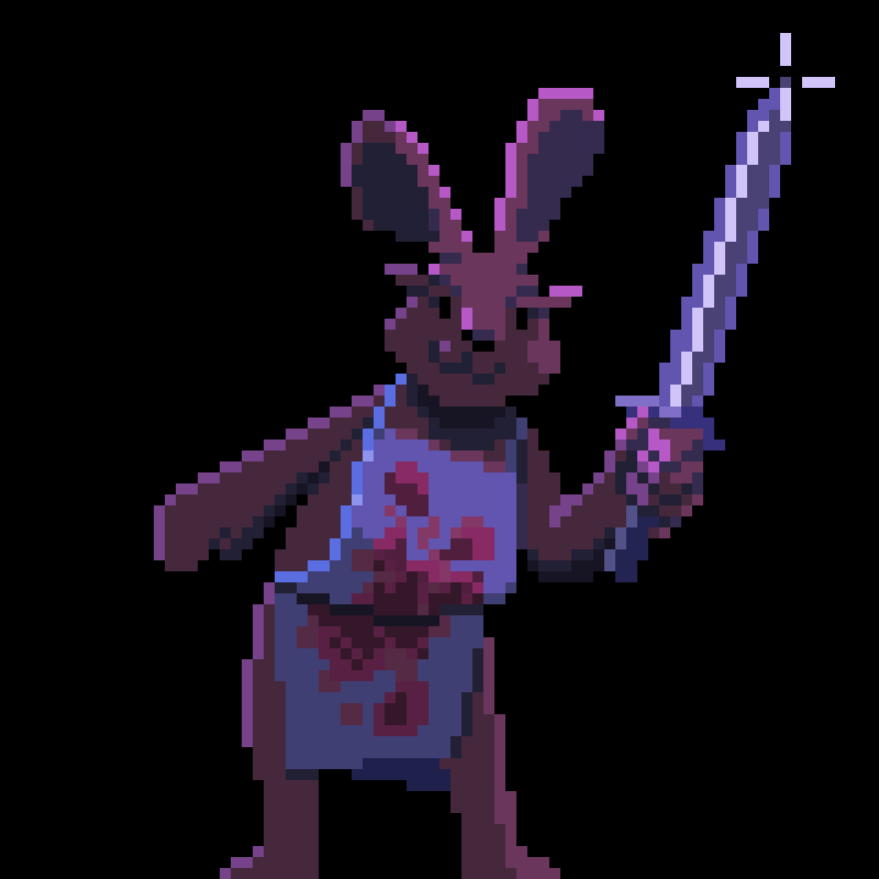
Sword bunny! Seems violent, but he's cute enough I forgive him. I manually picked the colors for the rim lighting and applied that on the same layer as the rest of the drawing, but the other lighting is from an overlay layer. I stuck with very simple, cartoony shapes for the body parts. I think having the face tilted at just a slight angle makes it more interesting.
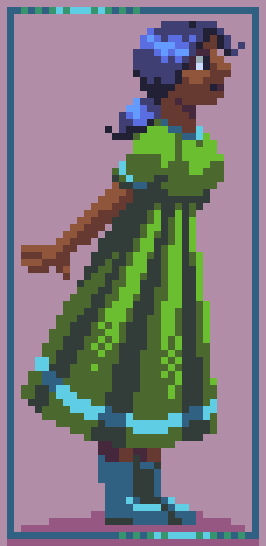
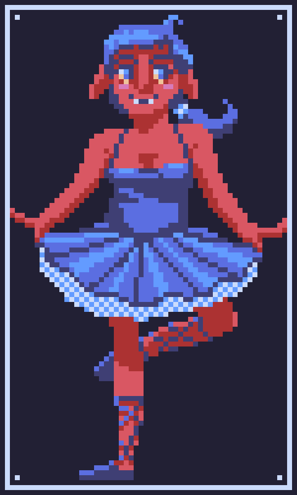
Back up to a medium size drawing. I think the contrast is too high on the dress. I like the hair. I didn't have any inspiration going in; I was just doodling around, so it's a bit uninspired.
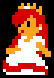
I took resolution in the opposite direction for this one. I had a video recommended to me on Youtube about a challenge going around on Twitter and Bluesky to redesign Princess Peach's sprite from Super Mario Bros on the NES.
Here's a summary of the events. The Youtuber said that, contrary to popular belief, lower resolutions are often harder to draw at than higher resolutions. I wanted to try it myself, and this is what I came up with! I used the same pixel dimensions as the original, and approximately the same colors (I didn't color pick, just eyeballed it). I think she looks pretty '80s!
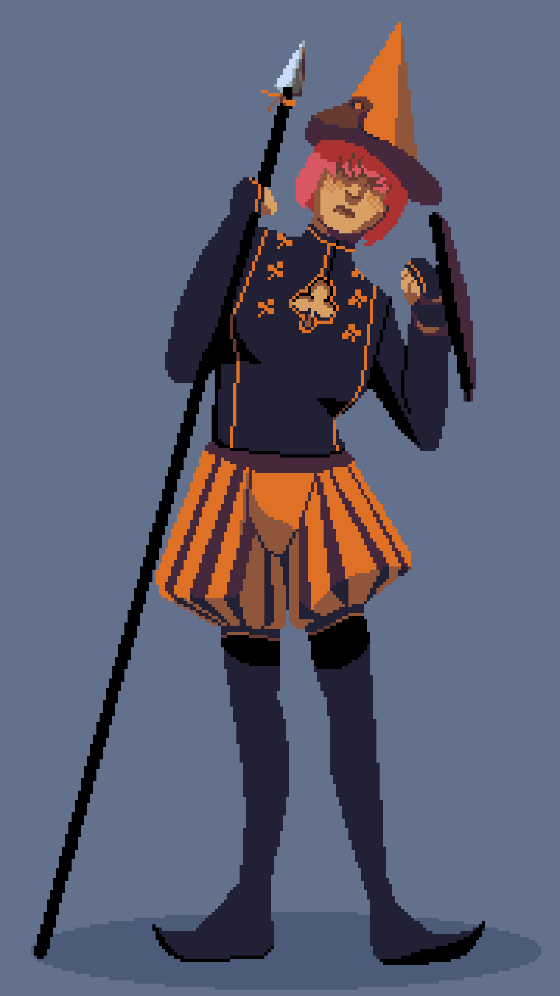
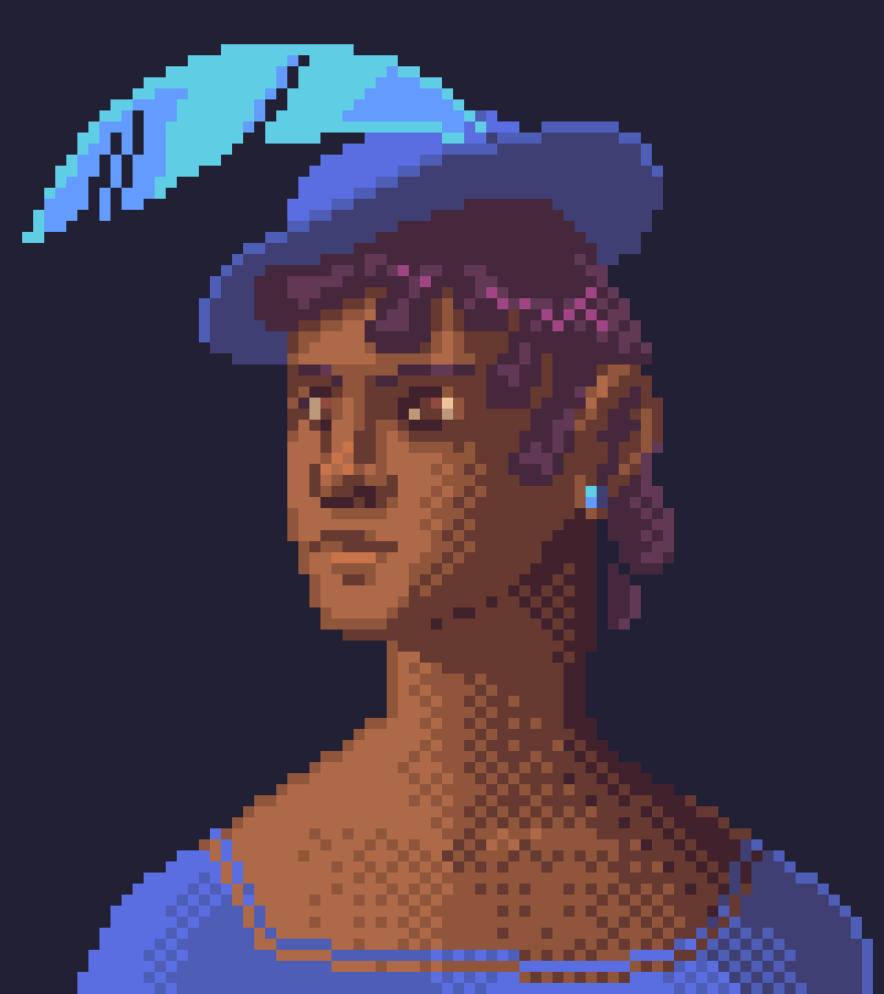
Character design exercise: 'page of clubs.' Wanted to come up with a cool outfit. Mixed results. Once again, I think the high resolution worked against me. Also, I should have tweaked the colors a bit.
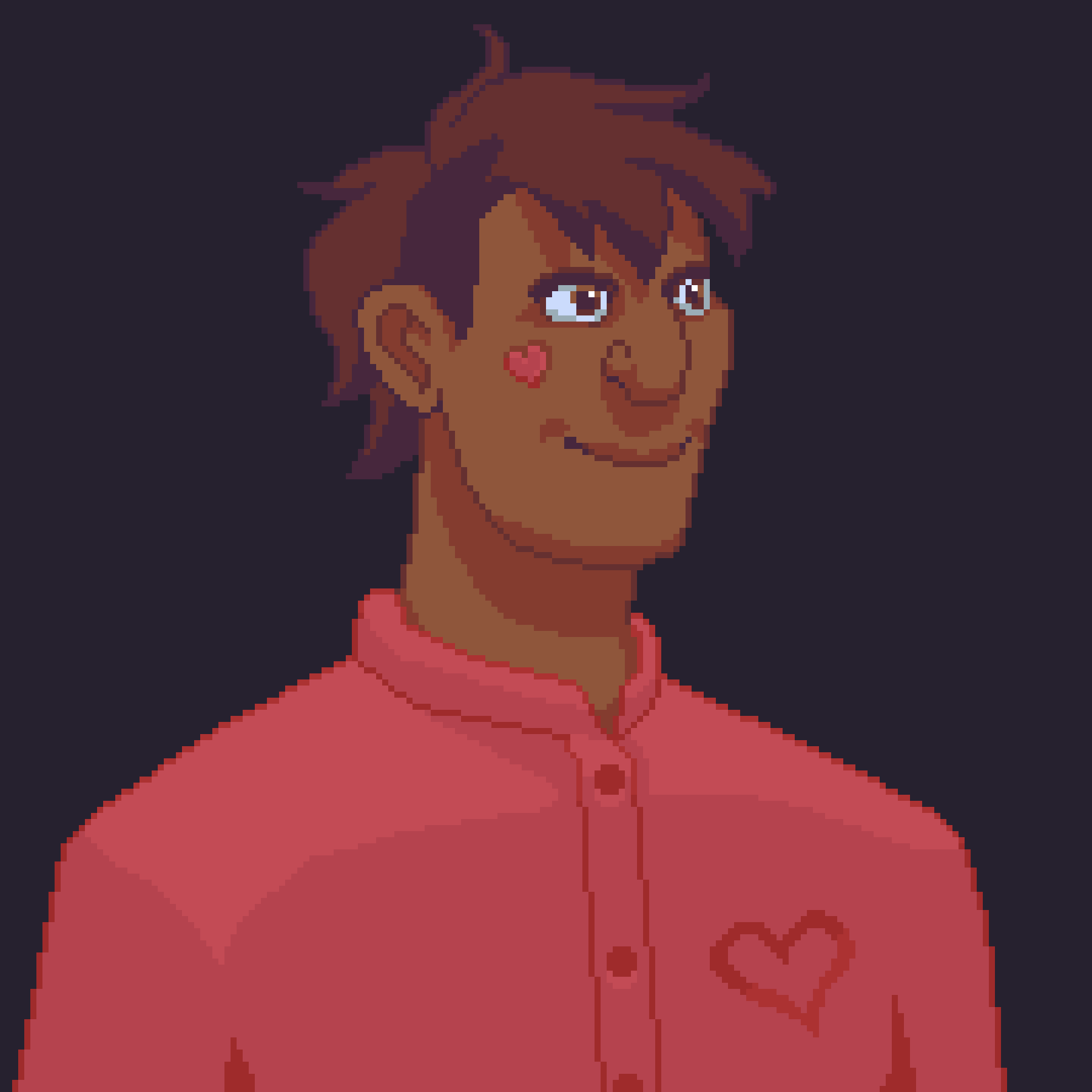
This one's more of a cartoony style. Not something I do often; fun. At this relatively high resolution and relatively low amount of details, can it even properly be called pixel art? Not sure where the heart motif came from. This was after I was given the tip by my sister that sclerae are more of a cool grey than a warm gray (oops). Thanks!
My mom's Dungeons and Dragons character, Scobra Stoneman! It really helped to have input on her design from her player. Her hair is meant to be a stripey buzz cut, based on a joke my mom made about her shaving down the middle of her head after she had her hair pulled in combat. Thankfully, it's grown out a bit since. The pose and camera angle are a little stiff. My favorite part about working on this one was finally figuring out how to use effect layers in Asesprite. I think I used Color Burn for this one, but I don't quite remember. Weirdly, I think the formulae for the various effects are different than what I'm used to.
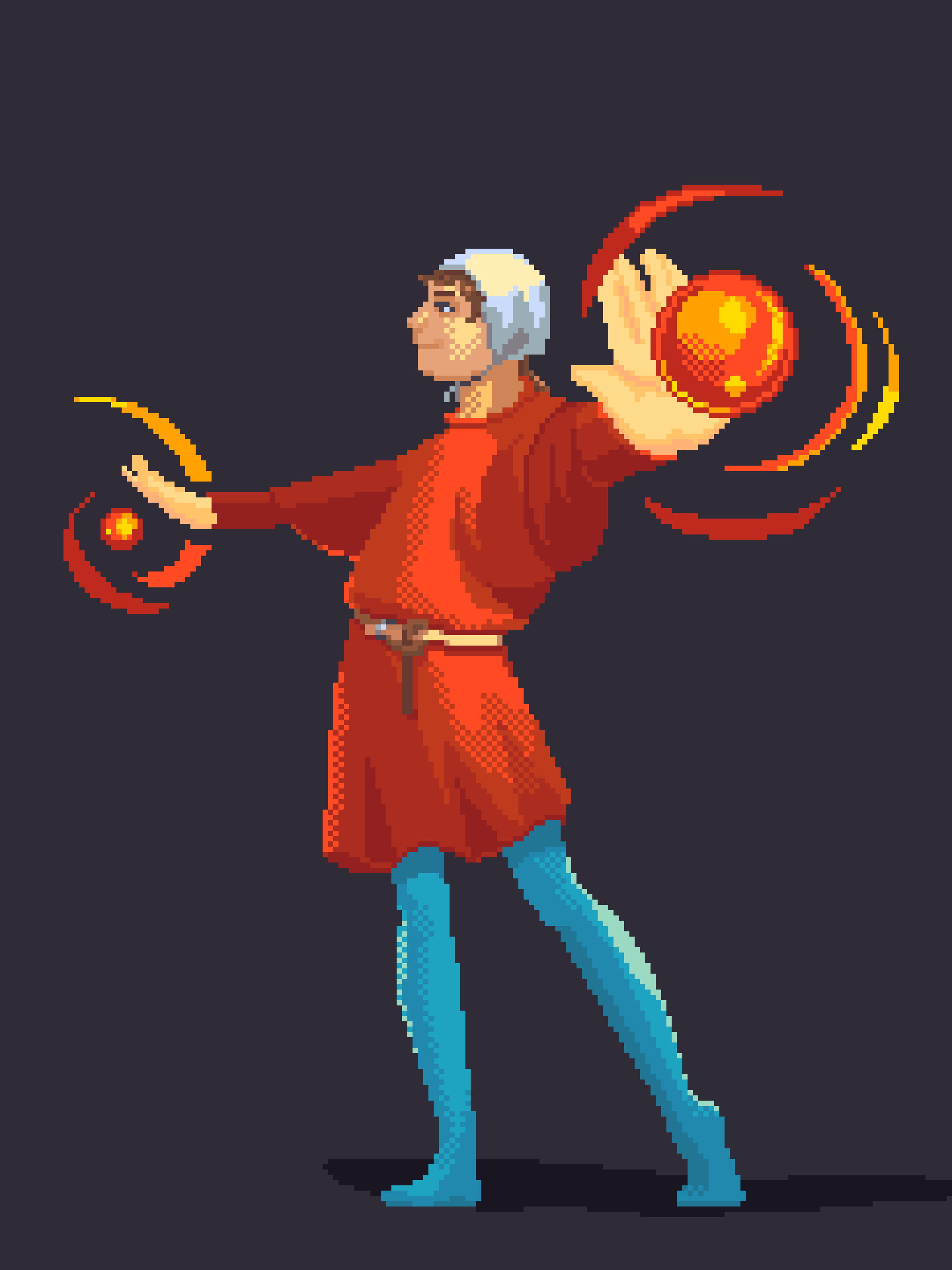
I made this while I was working on my Renaissance Festival costume. The clothes were simple enough (the sleeves were the hardest) so the focus was on light and shadow and dithering. I can't say I love it. The near hand is pretty weird, the hem of the tunic is a bit too wavy, the light is probably unrealistic, and so on. But I had a good time making it, and I really like how bright the red looks in its context.
Fanart of Hazuki from 'Tsukuyomi Moon Phase'! What a weird old (2004, according to Wikipedia) anime. Weird age gap pseudo-incest romance that manages to somehow come across as innocent and inoffensive? I think it feels that way because there's never anything sexual about the interest the leads have in each other, and Hazuki's visual design is cute in a non-sexual way. They never do annoying stuff like shots of her butt (that I noticed), and Hazuki's character arc of learning to be less selfish and more mature is genuinely really wholesome. I re-watched most of the first season recently to try to put together the blurry puzzle pieces of my childhood memories of the show. It's not bad, but nothing exceptionally good, either. As for the drawing itself, it was interesting to try more of that manga/anime style--particularly the early 2000s manga/anime style. All the how-to-draw books I taught myself from when I first really got into drawing were in that style, but as a young artist I wasn't...very good? And when I got better my style changed. So even though this drawing is a) pixel art and b) only 'pretty good,' it might be the best finished work I've ever done in that style.
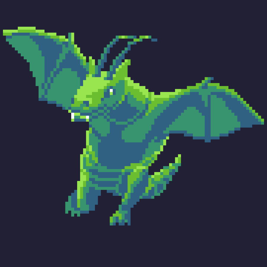
I've been doing a bit more of magical/mythical/monstrous creatures lately. It's not really my strong point. I found it especially difficult to fit the whole dragon on the canvas, and also to do the foreshortening well. So his wings are kind of stubby and his lower abdomen and tail look awkward. I always love a yellow-green to blue-green or yellow to blue color palette, though. Great for trees and foliage, but also lots of other things! One of the best color palettes, IMO.
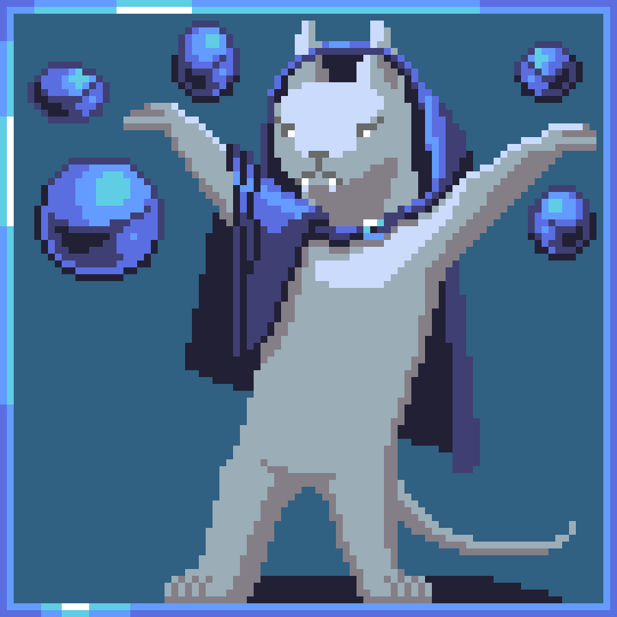
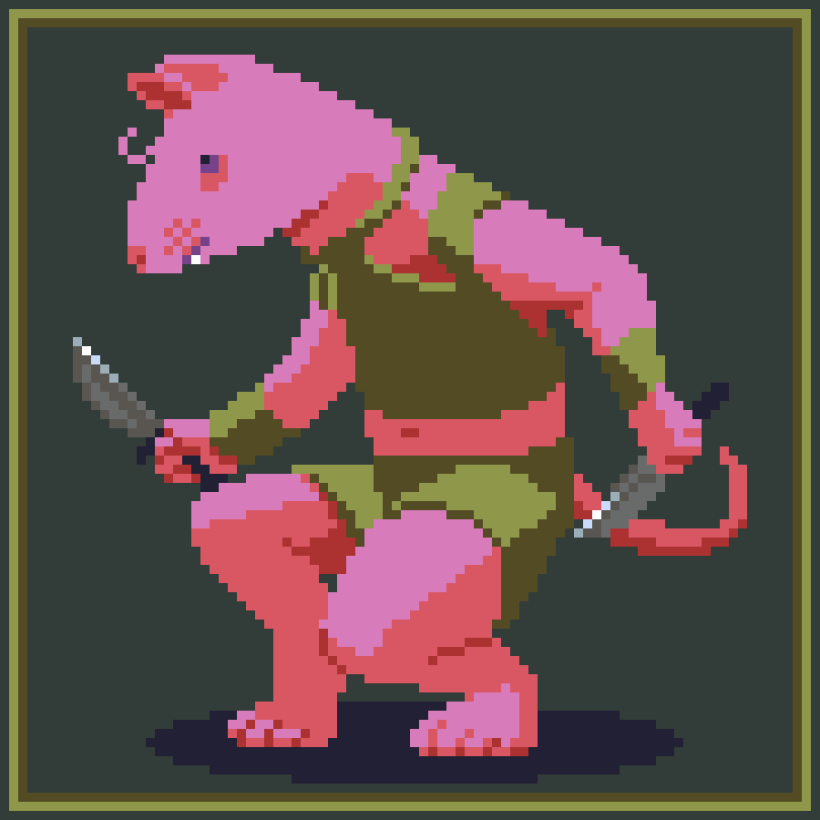
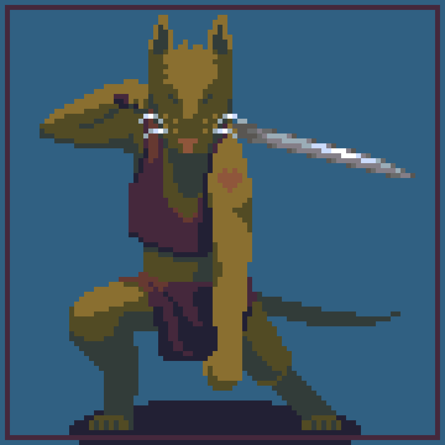
More rats! Posted in the order they were drawn. I'm not sure what the white one is--they're some other kind of magic user to the wizard. The pink rat is sort of a rogue or thief. He's my favorite. The rat with the heart tattoo is some type of warrior. In terms of D&D she might be called a monk (she's got no armor and shortswords are monk weapons, right?), but I don't think she's very pious. I used Asesprite's default 32-color palette for all 3 of these, 'cause constraints breed creativity (and, apparently, rats). I'm really happy with how they all turned out. ∑=• <--rat face
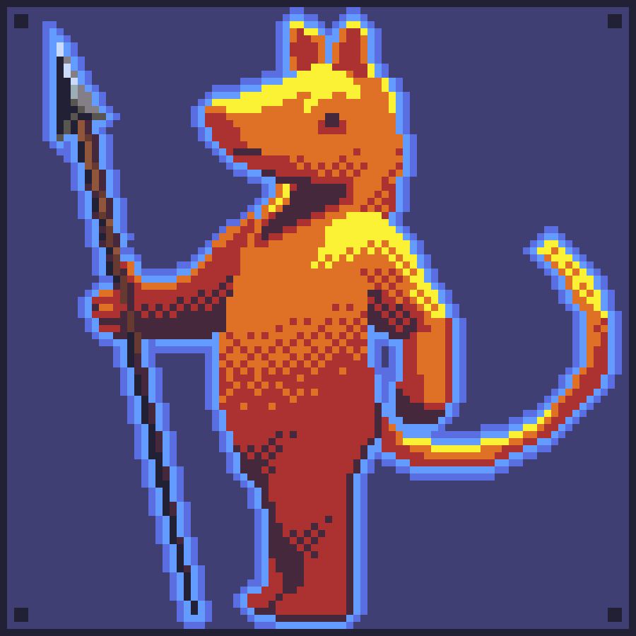
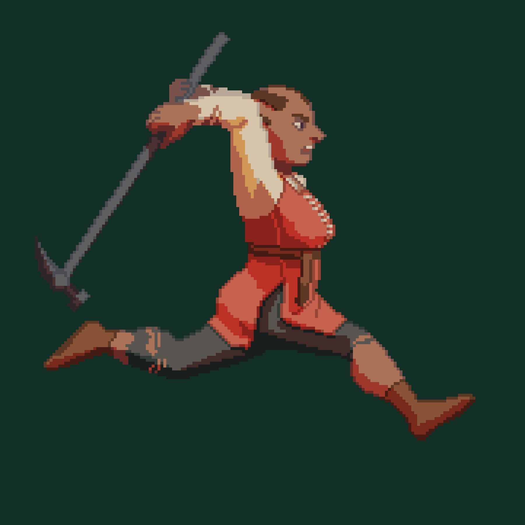
A rat with a spear. I think the design of this one is less interesting, but the colors were more of a challenge. I had trouble getting yellow, orange, red, and dark purple to work together, because they're each so different from one another, so I had to try to "blend" them. I couldn't get it to work until I replaced them with other, milder colors, got that to work, subbed them back in, and dithered until that looked okay.
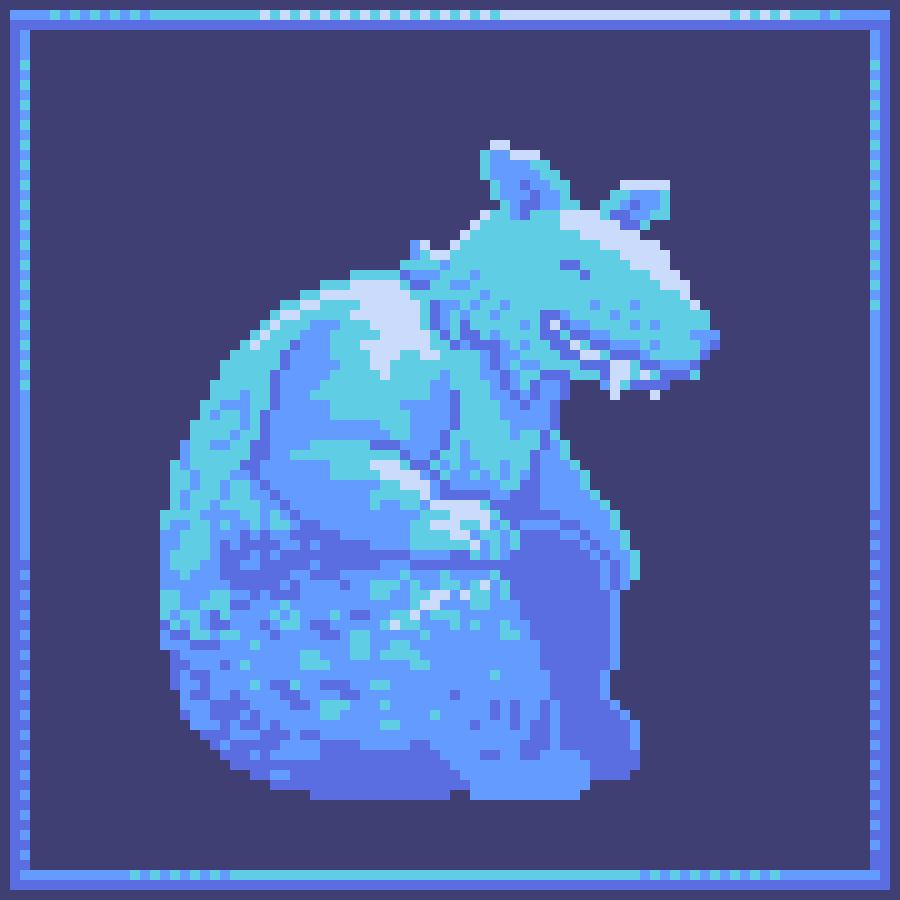
This is the first one I've done fur texture on. It was really fun to make; I love how happy he is. I could have made it higher-contrast. This one also doesn't have any props. NPC rat. Civilian rat.
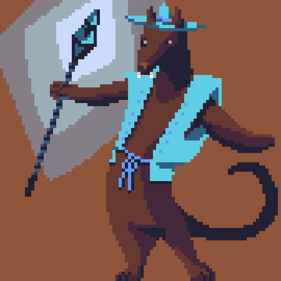
rat wiz! he's a wizard and a rat! he has a magic staff! rat wiz! --This drawing was just for fun. I wanted to draw a rat guy with a RPG class, and I ended up going with 'wizard.'
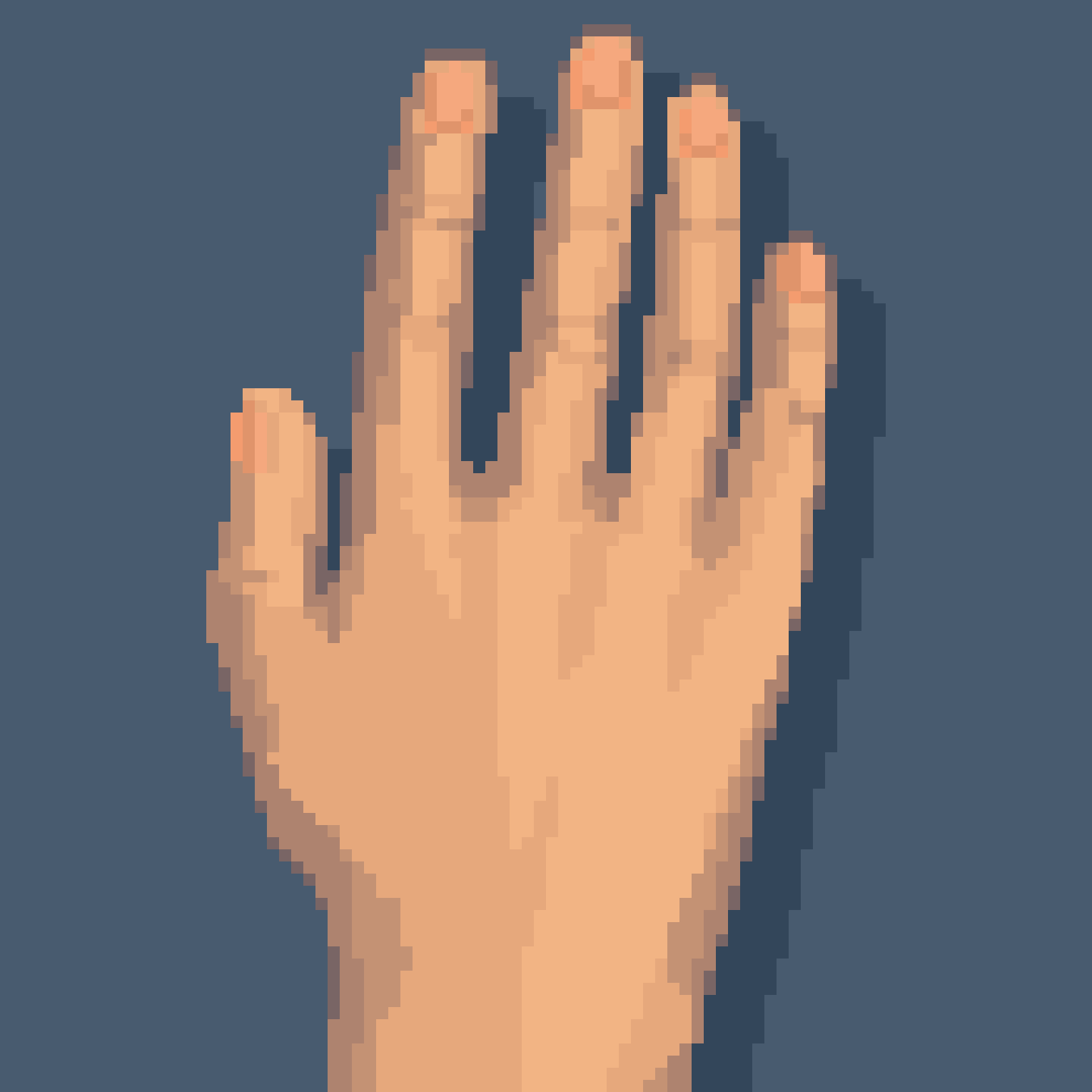
This was an exercise in drawing a realistic hand in a pixel art style. This is one I hope to come back to a few years down the line and re-do better. I can tell there's a lot of room for growth here, which is exciting. But I don't think this is too bad either. I did some manual (ha) anti-aliasing, which is to say I picked a color halfway between the darkest tone of the hand and the background and put that along relevant edges to create a smoother shape/the appearance of "half pixels."
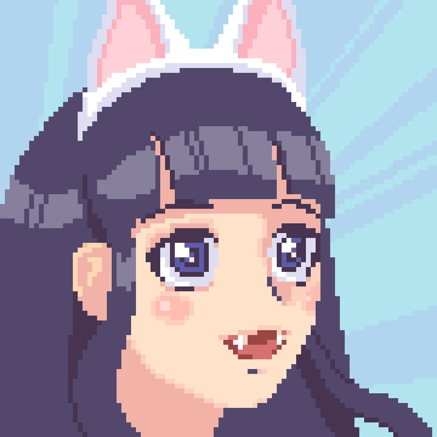
This one was really just for fun! I wanted to design a character with some personality, and I think I accomplished that. All the variations on cute girls have been designed already, so it's not very original, but... isn't she cute? :3
I did this a bit mindlessly as a warmup, so it took some time and fiddling around that it wouldn't have if I had gone at it more intentionally. The hardest part was making the tones of the skin and dress look smooth. The key here was dithering creatively. Since I only started pixel art pretty recently, dithering is still kind of a mystical art to me. I think the way I did it here, while haphazard, conveyed the light and shadow well enough.
I started with a 16x9 layout for this one, then upscaled it to 32x18 and added detail to experiment with moving from lower to higher resolution. I wanted to see if it could be a good workflow for me. I'm not sure if it is yet. I think the hardest part was the cat's head. I had it straight up and down first, but it looked too blocky. The ears and eyes were a little weird to place at such a low resolution; there's no 'perfect place' for them. Still, I think I picked the best place I could.
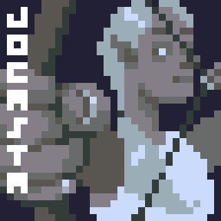
These are three minor NPCs in the D&D campaign I'm playing. They run our party's base while we're away.
I do my pixel art in a program called Asesprite. It cost me something like 20 bucks, but it's a really good program purpose-built for its medium and it was 100% worth it. At another computer, I had access to an old version of Paint that worked pretty well, but Microsoft changed it sometime in the past few years to be sleeker and more user friendly, and it has lost the straightforwardness and granularity that made it good. All this is to say, I used Asesprite to make these three pieces. Asesprite has a default color palette of 32 colors, and I challenged myself to use only those in these three.
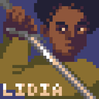
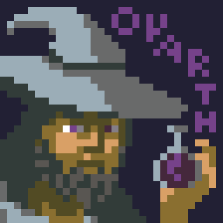
It was a challenge! I really like how Jocasta's colors turned out; less so, Lidia's and Ovarth's. Ovarth's colors are the worst. His skin tone is odd; the shadows are too saturated or warm, I think. His design is also uninspired. However, I really like what I did with the letters of his name, and his hand is not too bad.
The challenge with Lidia was the pose. I looked up some longsword stances after I already had started drawing the pose, and only one sort of fit my idea. The hands were tough, and I think the stance is too tight because everything had to fit "in frame." I like the angle of the crossbar at the hilt, and I like the fade of her skin into her hairline.
I'm really proud of how Jocasta turned out. Even in non-pixel art I have trouble with foreshortening; it's never quite exaggerated enough. With the low information given by the pixel art, I think the brain fills in the gaps better. I am quite proud of the hand pose, especially the fingernails. Jocasta's ponytail doesn't read very well and an arrow is missing from her bow, but I've been told that it looks like she's just testing the draw weight, so I'm not to bothered about that. I felt clever finding the tones I used for her skin. They really don't look like skin tones out of context, but in context they evoke pale-to-light-brown skin under a cool light.
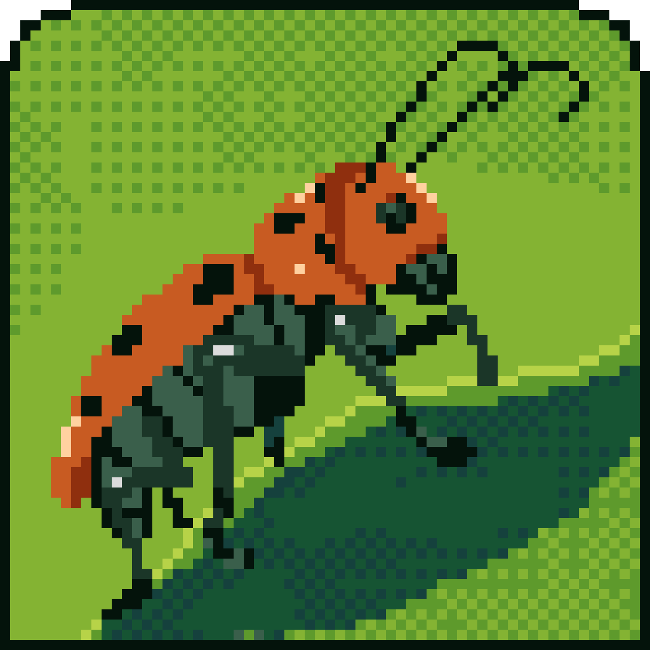
Here's the red milkweed beetle from the home page. I worked from a photo reference from my search engine to make it. The most difficult thing was distinguishing the blacks and grays to make the legs and abdomen clear. In the photo, the colors were a lot lighter. The beetle has lots of little hairs or hair-like structures (I'm no entomologist) on the black parts of its body which reflect light. With the low resolution, I didn't feel like I could show this effect on the color while still conveying that the bug's base color is black. I also had trouble with the shape of the head, eye, and mouthparts, and with the leaf. I would've liked to use fewer colors & be more minimalist, but I didn't feel I could do so and still create an appealing image. Anyway, I'm proud of how cute and cheerful it turned out.
home |
pixel art |
other art |
blog