other art
repository
home |
pixel art |
other art |
blog
On this page, you can find some of my non-pixel digital art along with artist's statements about what I liked, disliked, and/or learned from the process of making each piece. The oldest works are at the bottom. Thanks for your interest!
 Originally posted on Reddit.
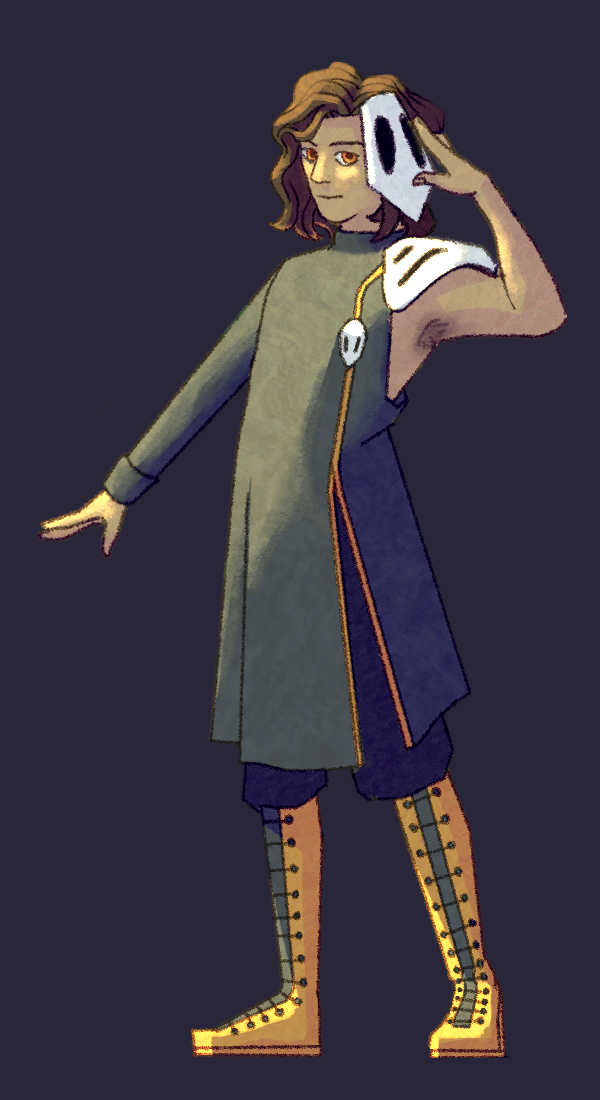
Same context as previous, except not anything about a workbook, just somebody's OC. I expected a better result going into this than I got; I was disappointed. I think the hair is too big and the pose is too stiff and the costume is too boring. The lighting is too much and not enough. But it's not bad, per se, just uninspired. I wish I could have better done justice to the original poster's sketch.
 Originally posted on Reddit.
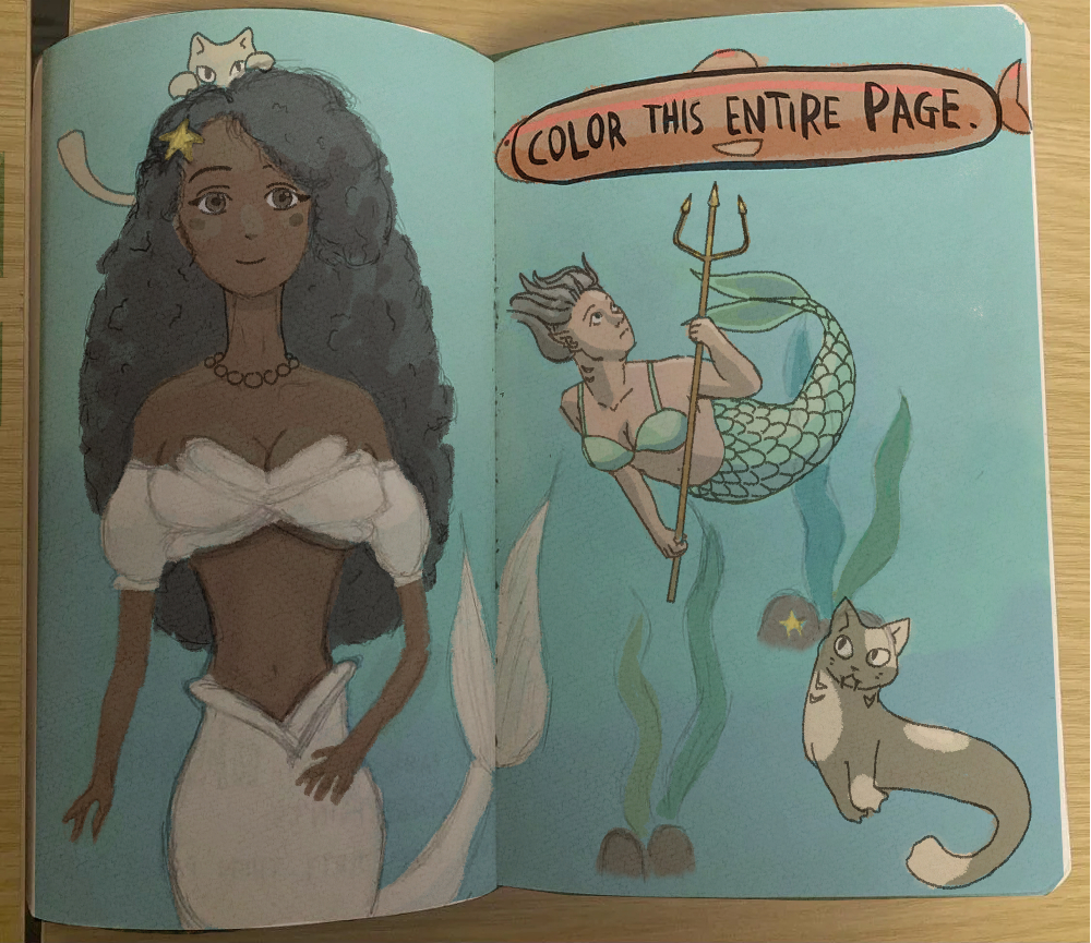
Same context as previous, except the prompter took a photo of an old incomplete drawing in a secondhand creative workbook and asked that someone complete it. Follow the link and click 'see full discussion' to see the original. I used a multiply layer for the colors to make it look more convincingly as if I drew this on the actual paper. There's no way to know who drew the first mermaid (left), but I thought it was kind of beautiful to be able to do a collaborative work with a mysterious unknown past artist. I wonder if they would like how I finished it?
 Originally posted on Reddit.
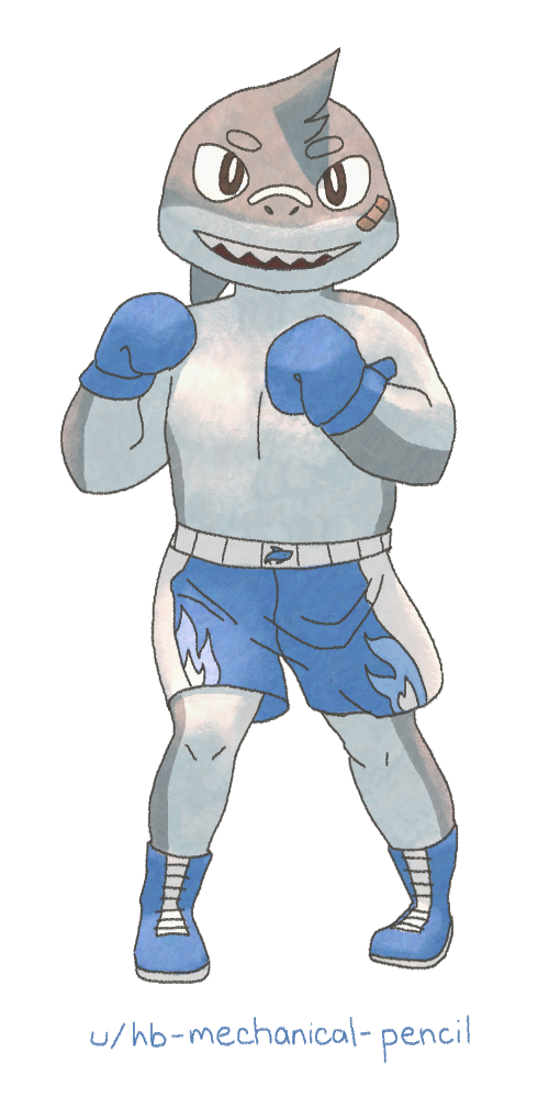
Same context as previous. This one turned out almost as perfectly as I could have expected! The only real issue I see is the back foot, where the ankle is weirdly narrow. And maybe the eyes should have shadows on the lower halves. But this turned out looking so cute and polished. I'm proud of it!
 Originally posted on Reddit.
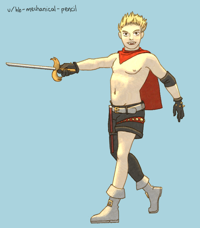
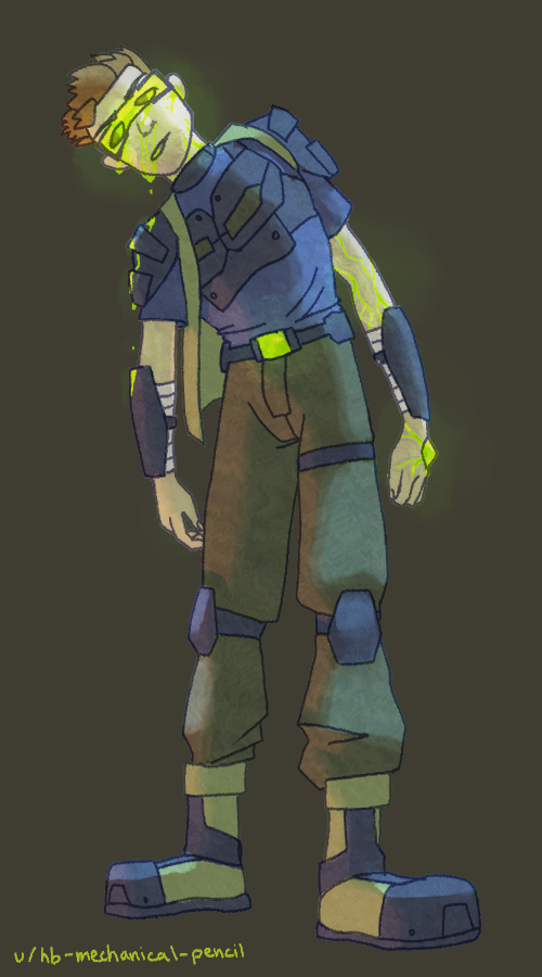
Same context as previous. I REALLY like how the shading on the torso turned out. I think the 3D forms of the chest, ribcage, and stomach look convincing. I also like how bright the reds turned out. Otherwise, I feel like he looks too pale and too skimpily dressed. I guess it's not my place to judge. :P Also, the rapier is only about half the length of a real one, unless this guy's really, really tall, but it was the only way for the sheath to still fit in the specified spot on top of the thigh.
 Originally posted on Reddit.
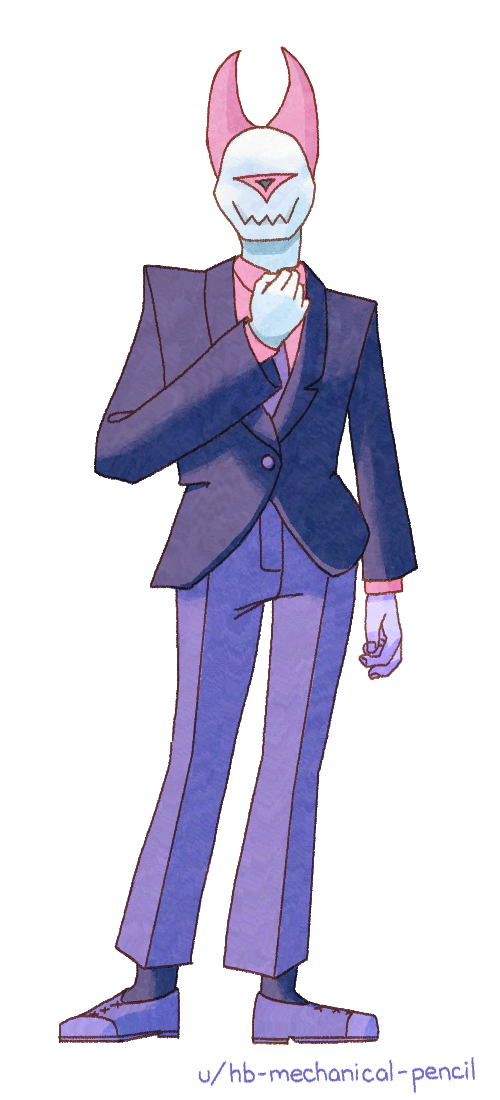
Same context as previous. I recently watched a
YouTube video essay about fashion, and about fashionable suits in particular. (I found it really interesting, and actually watched it twice.) So, I was excited when I saw a prompt about a suit. Is the suit I drew actually fashionable? I dunno. Looks good to me, though.
 Originally posted on Reddit.
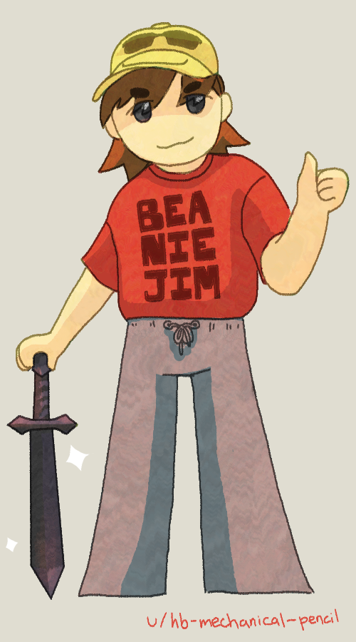
Not my character; context explained previously. Also done with my computer mouse. I don't know the significance of the words on the shirt. The simplicity of this one made it quicker to finish, which was satisfying. If I were to do it again, I would make the shading on the sweatpants softer. Apparently, Color Dodge doesn't solve all ills...
 Originally posted on Reddit.
This was a 'free commission,' I guess you could call it. I drew it for a stranger on Reddit in the 'I Can Draw That' subreddit, whose request I picked for its clarity and brevity. I drew it with my computer mouse, 'cause I felt like it. The really fun thing about this was 'translating' from the originally provided design to my own style. Personally, I find the American cartoon styles of the aughts and 2010s slightly obnoxious, so redesigning this character was like scratching an itch. Something interesting about this one was trying to shape the pose/body. I tried to strike a balance between making smooth action lines to guide the eye and accurately portraying the bumpy details of the clothing shapes.
home |
pixel art |
other art |
blog